It is no exaggeration to say that the National Picasso Museum in Paris changed my life. I first visited on a school trip when I was 17 and curious about modernism. Until that day, I hadn’t “got” Picasso. Perhaps I needed to be immersed as one can only be with this extraordinary collection, in the venerable and austere spaces of the private mansion that houses it, the Hôtel Salé. But I still remember the shock of that epiphany; it was as if, like the cubist works that occupied certain rooms, my vision of the world had both broken and opened up. My memory of first seeing a portrait of Dora Maar in 1937 is like one of those eye-opening movie scenes where the protagonist’s life flashes past them in a momentary, rumbling vortex.
A new orthodoxy that declares that art in itself is not enough
I write this not out of nostalgia but because the Picasso Museum is celebrating the 50th anniversary of the death of Pablo Picasso with Picasso Celebration: the collection in a new light, a project which, according to the president of the museum, Cécile Debray, “prefigures the Picasso museum of tomorrow” and explicitly tries to attract new and young visitors like I was that day. The efforts of Debray and his co-curator Joanne Snrech point to a promising future that recognizes a social context for looking at Picasso that has completely changed since I met in the 1990s.
One innovation is the inclusion of female artists who were Picasso’s contemporaries – works by Louise Bourgeois and a wonderful photo collage by Dora Maar, 29 rue d’Astorg (1936). Elsewhere, works by contemporary artists are beginning to offer new interpretations of Picasso’s life and work, including works by Nigerian-born painter Obi Okigbo and Congolese artist Chéri Samba.
But these are not the flagship interventions. The boldest statement is the invitation to British fashion designer Paul Smith to lead the artistic direction of the displays. Smith admits in the exhibition catalog that he has “little academic knowledge of Picasso”. Describing his approach, he often uses the word “visual”: he has put together “more of a visual experience” that is “interesting for a younger audience”, he says; Smith repeatedly insists that he is “a very visual person”. And no one who sees this presentation will doubt that it has an impact on the eyes. But the effect is catastrophic.

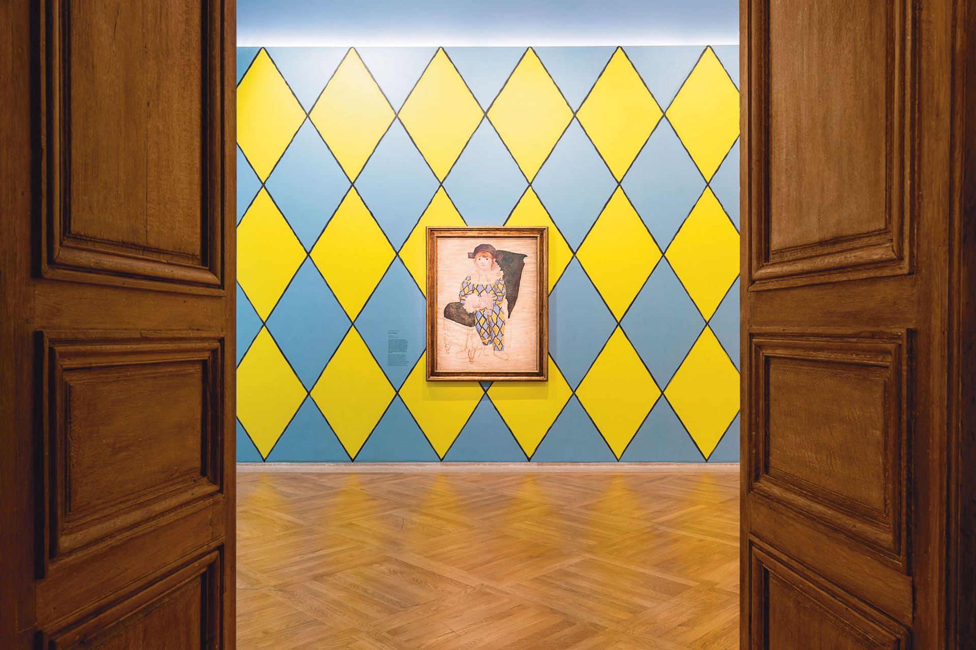
Installation view of Picasso’s portrait of his son, Paul as Harlequin (1924) © Picasso-Paris National Museum, See You (Vinciane Lebrun) and Succession Picasso 2023
It starts badly and never really recovers. by Picasso bull head, the 1942 sculpture in which he took the handlebars and seat of a bicycle and arranged them eerily like a bull’s head, stands alone on a wall opposite 16 contemporary versions of Smith, a cycling enthusiast: 15 of Smith’s seats are black, one is sporting his signature colored stripes. I have no idea what he intends to suggest here about the Picasso sculpture, other than that the bicycles still exist and may be Paul Smith branded.
The change of scenery continues, room after room. Paintings from the Blue Period, such as Picasso’s early bearded self-portraits and La Célestine (Woman with a pillowcase) (1904), are hung on blue walls, into which they sink rather than emerge. Nude studies done before The Ladies of Avignon (1907) are dipped in shocking pink so that the subtleties of their coloring – delicate pinks and ochres – are all the more pale.
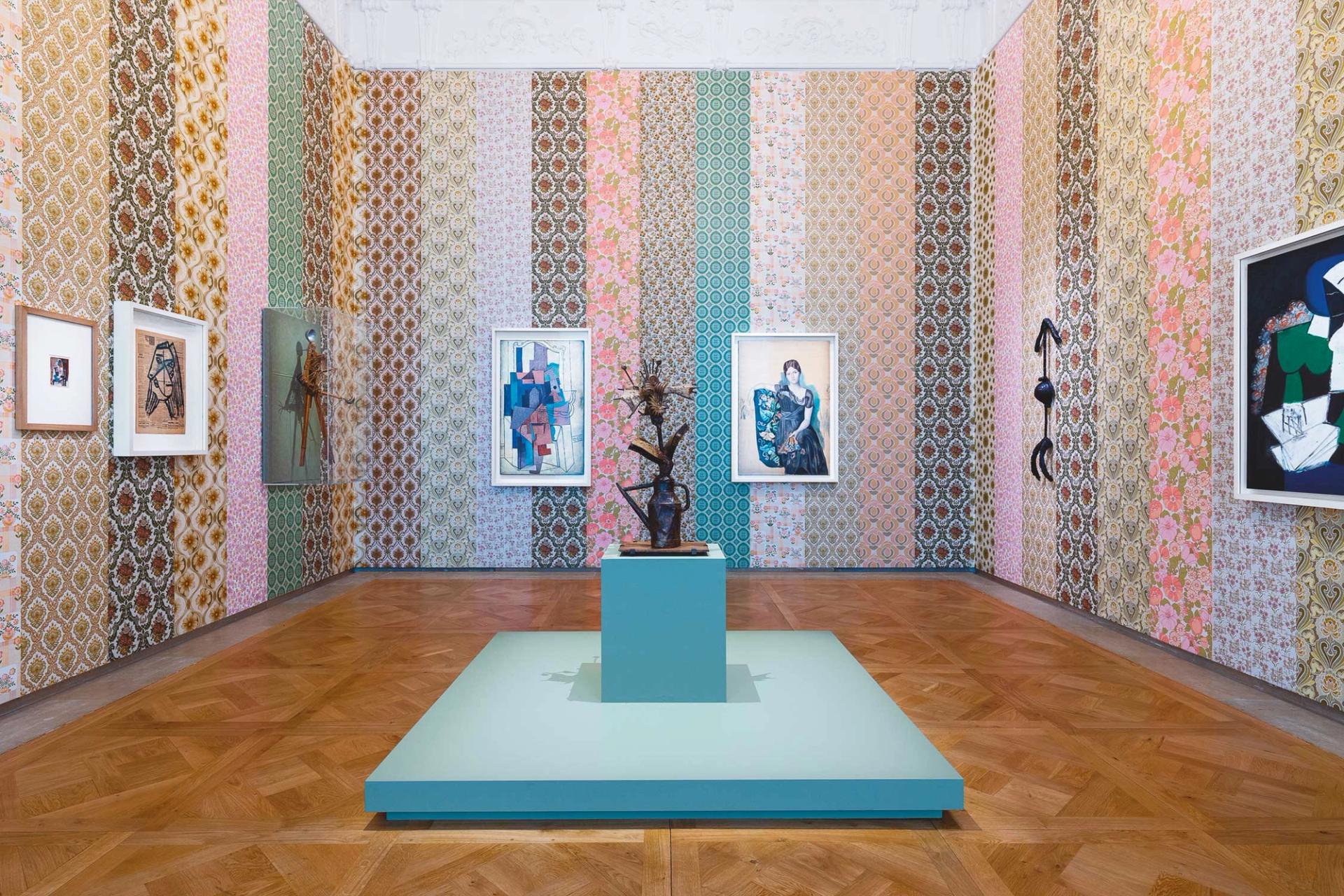
Elsewhere, a group of collage-themed works from different periods are brought together. They include the great first cubist collage, Still life with cane chair (1912) – an oval, rope-edged, with the rattan-patterned oilcloth accompanied by a painted still life with a newspaper, candle and knife – and the 1959 sculpture of a pregnant woman, clearly inspired by African art, where the figure effectively becomes an arrow with arms at the tip and legs at the tail, its pregnant belly a ball in the middle. But they are laid over strips of busy floral wallpapers that declare a visual war on whatever is placed there.

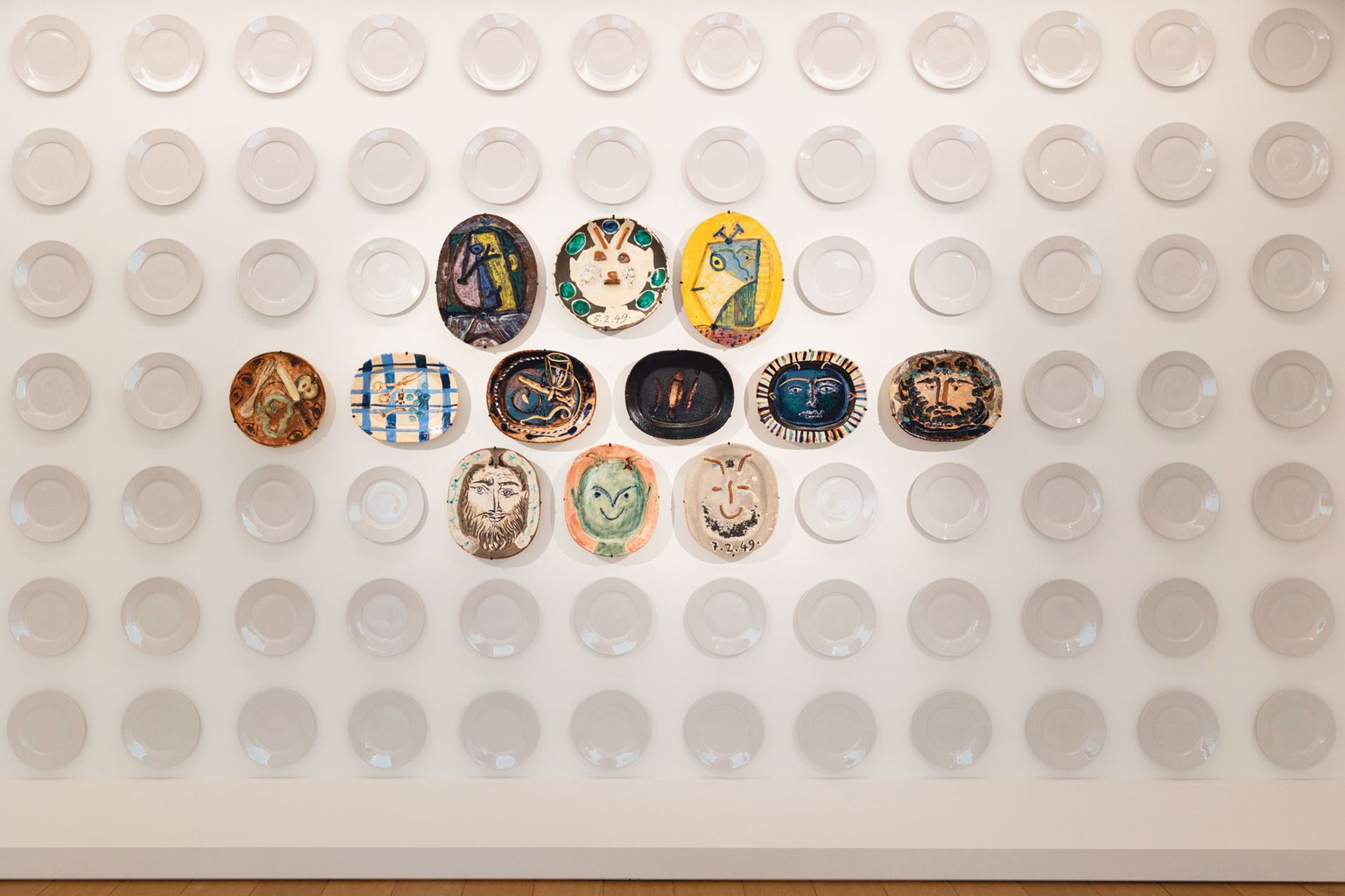
An installation view of Picasso’s ceramic plates © Vinciane Lebrun/Do you see
To use the language of fashion, works of art become accessories for Smith’s decorations. At no time do they take advantage of their surroundings. Two mid-1920s classic period portraits of Picasso’s son Paul as commedia dell’arte characters Harlequin and Pierrot are placed amid walls whose patterns explode the details of their outfits, diminishing again the delicate and tender power of the paintings themselves. A cluster of Picasso-inspired pieces on ceramic plates, from ancient Greece to 16th-century Palissy, are not allowed to breathe and exist in ample space, but rather gathered together in a tight group in the middle of a grid of floor-to-ceiling dishes from a plain white dinner service. Apparently, it is an attempt to “question the relationship between mass-produced industrial objects and those produced in an artisanal way”. But “question” how, exactly?
Smith says his approach was deliberately “spontaneous” and “instinctive”, adding: “I never worked on anything”. This is the main defect of the whole company: an absence of intellectual rigor. Perhaps the nadir of the entire display is a space where the thought process seems to have been “let’s hang this striped image next to this striped image on some stripes.” One such painting is the seated portrait of Dora Maar that moved me so much all those years ago, which is dazzlingly resilient in its invention and intensity – at least, when you get close enough to block the wretched blue and white stripes that it hangs on.
This is not a plea for white cubes and purist modernist aesthetics or for the Picasso Museum to be risk averse. Now is the perfect time to rethink their portrayal of Picasso and the unique resources in this collection, and bring some radical intelligence to their programming. But for all that Smith may claim his presentation is “unconventional,” commissioning it is a conservative act. Of course, his idea that you can make the Picasso Museum more visual is nonsense – few artists seem to have thought about and explored the nature of looking and seeing more than Picasso, and it’s written all over his works. But perhaps the key term in Smith’s words is “visual experience”, especially when combined with his assertion that this is a show for “the pop world in which we we currently find” where “everything is very immediate on people’s phones”.

Another decorative room in the Picasso Celebration exposure © Picasso-Paris National Museum, See You (Vinciane Lebrun) and Succession Picasso 2023
Its scenography is part of an insidious new orthodoxy, allied to ubiquitous immersive experiences, which declares that art in itself is not enough; it needs spectacle, gimmickry, instagrammability. This not only respects the art, but also the public.
And to expose this trend, just go down to the Picasso Museum and see the Faith Ringgold show which traveled from the New Museum in New York. Beautifully displayed on plain white walls, the paintings, sculptures and quilts attracted a diverse audience of all ages. Many were in rapturous communion with the works, and yes, often with a smartphone in hand. So in this great museum epiphanies are always possible – please just trust the art.
• Picasso Celebration: the collection in a new light, Musée National Picasso-Paris, until August 27. Curators: Cécile Debray and Joanne Snrech. Art Director: Paul Smith

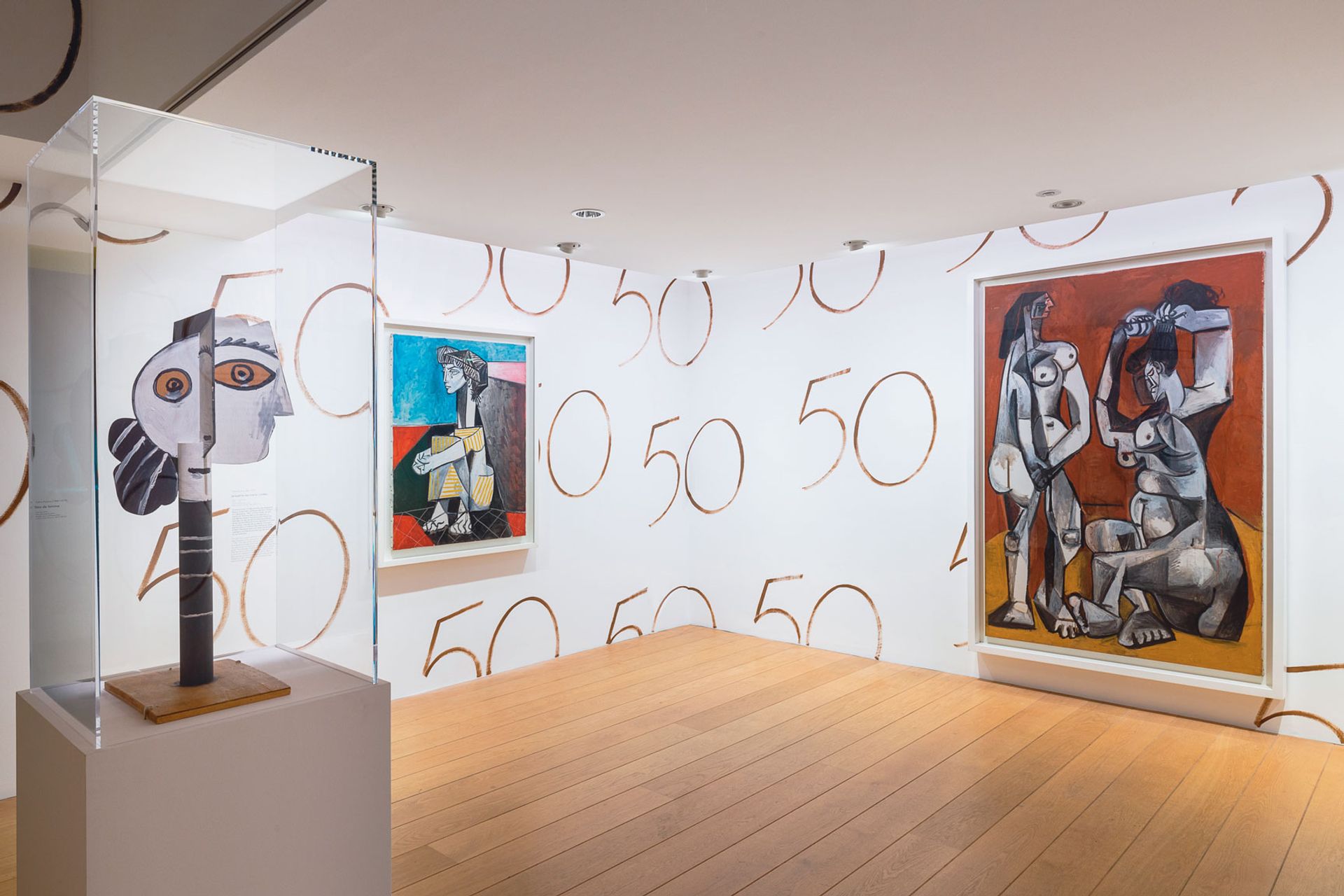
Installation view of Picasso Celebration parisian exhibition © Picasso-Paris National Museum, See You (Vinciane Lebrun) and Succession Picasso 2023
What Other Reviewers Said
In the French magazine Connaissance des Arts, Guillaume Morel suggests that Paul Smith’s set design can be humorous and lighthearted, “words rarely associated with an exhibition”. He argues that the “one thousand and one surprises” of Smith’s staging “never interferes with the readability and understanding” of the museum’s masterpieces.
Judith Benhamou writes in the French newspaper Les Echos that while it is “certainly good to draw a fresh eye to museums”, Smith has “enjoyed too much freedom” and the sets are “anecdotal”. She praises Smith’s “practiced eye for pattern” but criticizes his “lack of imagination”, notably in the decision to show Picasso’s paintings from the 1950s on “wallpaper overrun with the number 50”.
