There are few constants in the art world. The lasting appeal of oil painting on canvas is one. The frequent invocation of artists’ biographies to interpret (and market) their work is another. Yet another, oddly specific and equally oddly consistent, is that every six decades, the leading art museum in Buffalo, New York, undergoes a transformative expansion. The Buffalo AKG Art Museum (formerly Albright-Knox Art Gallery) occupies a campus in New York State’s second largest city that now includes buildings completed in 1905, 1962 and 2023.
The latest, inaugurated last month, was designed by Shohei Shigematsu, a partner in the New York office of the architectural firm OMA, in collaboration with the New York firm Cooper Robertson. It was shaped by extensive community outreach and several town hall-style feedback and brainstorming sessions with local residents. It is the centerpiece of a $230 million fundraising campaign that began more than a decade ago and has also involved major renovations and interventions in the two previous buildings: the neoclassical structure by EB Green, the Robert and Elisabeth Wilmers Building, whose marble colonnade projects a mark of early 20th-century civic pride; and Gordon Bunshaft’s mid-century modern addition, the Seymour H. Knox Building, with its elegant if somewhat austere geometry.
Shigematsu’s addition, the Jeffrey E. Gundlach Building, beckons passers-by. Located to the north of the Wilmers Building and connected to it by a winding elevated walkway clad in reflective glass, it radiates openness and transparency.
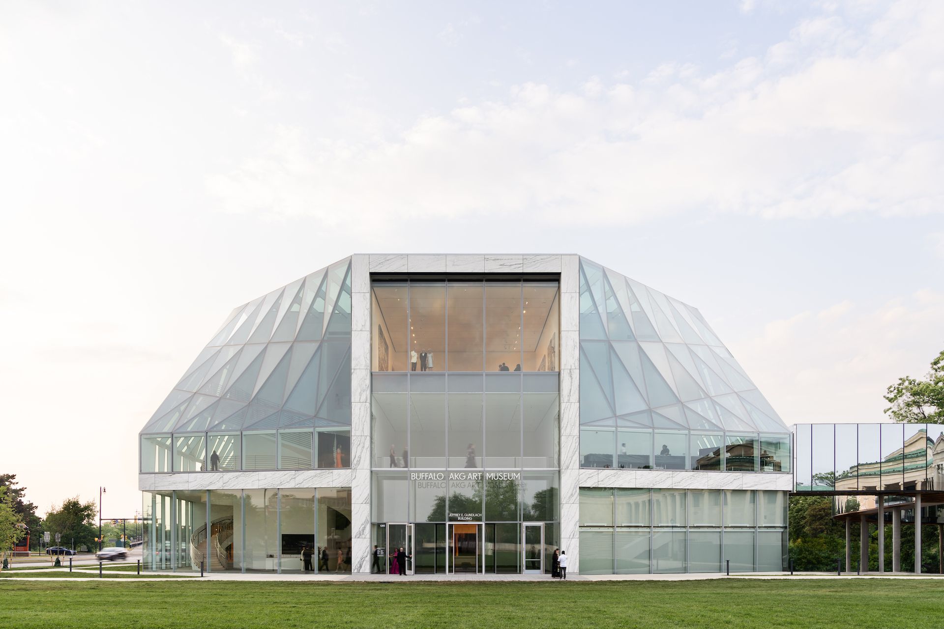
The new Jeffrey E. Gundlach building at the Buffalo AKG Art Museum Marco Cappelletti
“Part of the reason we chose this site was that the museum was, ironically, surrounded by Delaware Park, so there was a long distance from the main boulevard to town to get to the museum,” says Shigematsu. “Sometimes it’s good to have a procession, but sometimes it also creates a feeling of distance for the public. So now the old buildings are still located in the park, but the new building really faces the street.
The Gundlach building, in addition to creating another entry point to the museum, includes 13 new galleries totaling 27,000 square feet, as well as a 6,100 square foot enclosed sculpture terrace. More prosaically, it includes a loading dock and a freight elevator, essential rear house elements that the museum did not have before. The galleries are traditional white-walled spaces, arranged in a “plus” sign configuration, with an inaugural program that includes a bravura display of the museum’s works 33 works by abstract expressionist painter Clyfford Still (until February 19, 2024) and a selection from the 518 objects acquired during the four years of closure for construction. In a clever aesthetic reminder, the marble used in the thresholds between the new galleries was quarried from the same part of Vermont as the marble used 120 years ago in the construction of the Wilmers Building.
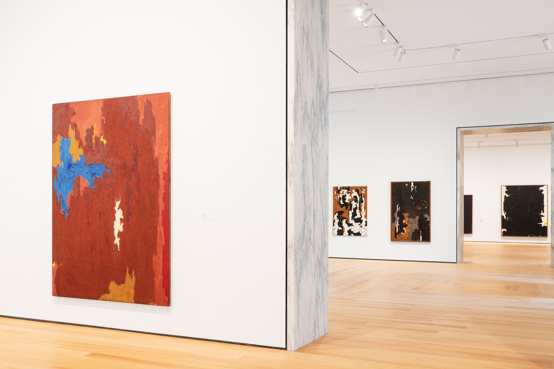
Installation view of Clyfford Still: A Legacy for Buffalo on the first floor of the Gundlach Building of the Buffalo AKG Art Museum with, from left to right, January 1950-D (1950), January 1947 (1947), 1946-N (1946) and 1947-8-W-No. 2 (1947-48) Marco Cappelletti
Around the exterior of the new galleries, large-scale works by Ursula von Rydingsvard, Christine Sun Kim, Lawrence Weiner and others beckon passing drivers and joggers from the terraces of the Gundlach building, which are enclosed in a veil of glass. “Rather than spending too much time trying to redefine galleries, we thought the need for audience engagement through playful space and improvisation should be our domain, so we used galleries as a core and designed things around them,” says Shigematsu. “We made it transparent to be more welcoming and communicative.”
The sense of openness and invitation conveyed by the design of the Gundlach building is also evident in the interventions of Shigematsu and his collaborators on the museum’s earlier buildings. Most transformative was enclosing the open-air square courtyard of the Knox Building. What was once an underutilized sculpture garden with a lone tree is now the heart of the museum, an entryless “town square” that serves as the main entry point and thoroughfare for walkers entering and exiting Delaware Park. And its canopy is not simple utilitarian architecture, but a work commissioned by artist Olafur Eliasson and architect Sebastian Behmann.
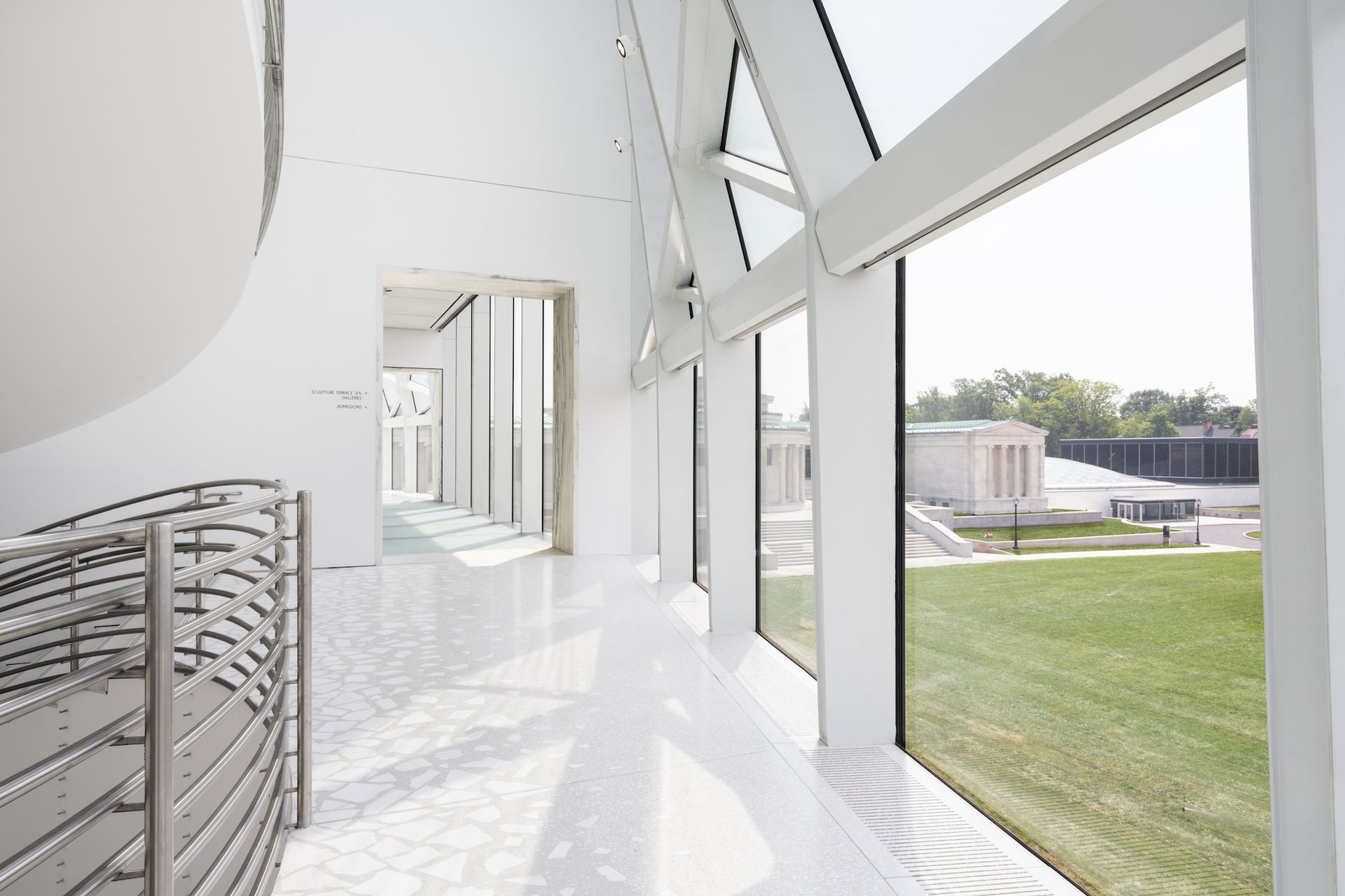
The sculpture terrace on the second floor of the Gundlach Building with a view of the Buffalo AKG Art Museum campus Marco Cappelletti
common sky (2022) is an asymmetrical intervention in Bunshaft’s structure, with a funnel-shaped glass column that descends to the ground precisely where the only tree in the courtyard previously stood. Floating just below this curved glass ceiling are triangular mirror panels that perform light and noise control functions, while providing fleeting selfie opportunities, although the best selfies are found nearby in the museum’s new gallery inaugural exhibition, showcasing the 1966 installation by Lucas Samaras mirror room (until January 2, 2024).
“The idea of inclusion is not so easy to translate into architecture,” Behmann says of common sky. “What we have created here is not a sculpture or an object, but a system. You become part of this system. It is a representation of what a man-made space looks like. It offers, in Eliasson’s words, “the opportunity to see yourself in the sky”.
This new town square connects many of the museum’s most public and community-minded spaces, from the state-of-the-art new classrooms, the Free Gallery and a restaurant featuring a site-specific mosaic by Dominican American artist Firelei Báez, to a space for play and interaction dubbed Creative Commons that marks the first partnership between an art museum and the Lego Foundation. “The museum is a community resource, and as part of that, we want to be a space of community well-being,” says Charlie Garling, director of learning and creativity at the museum.
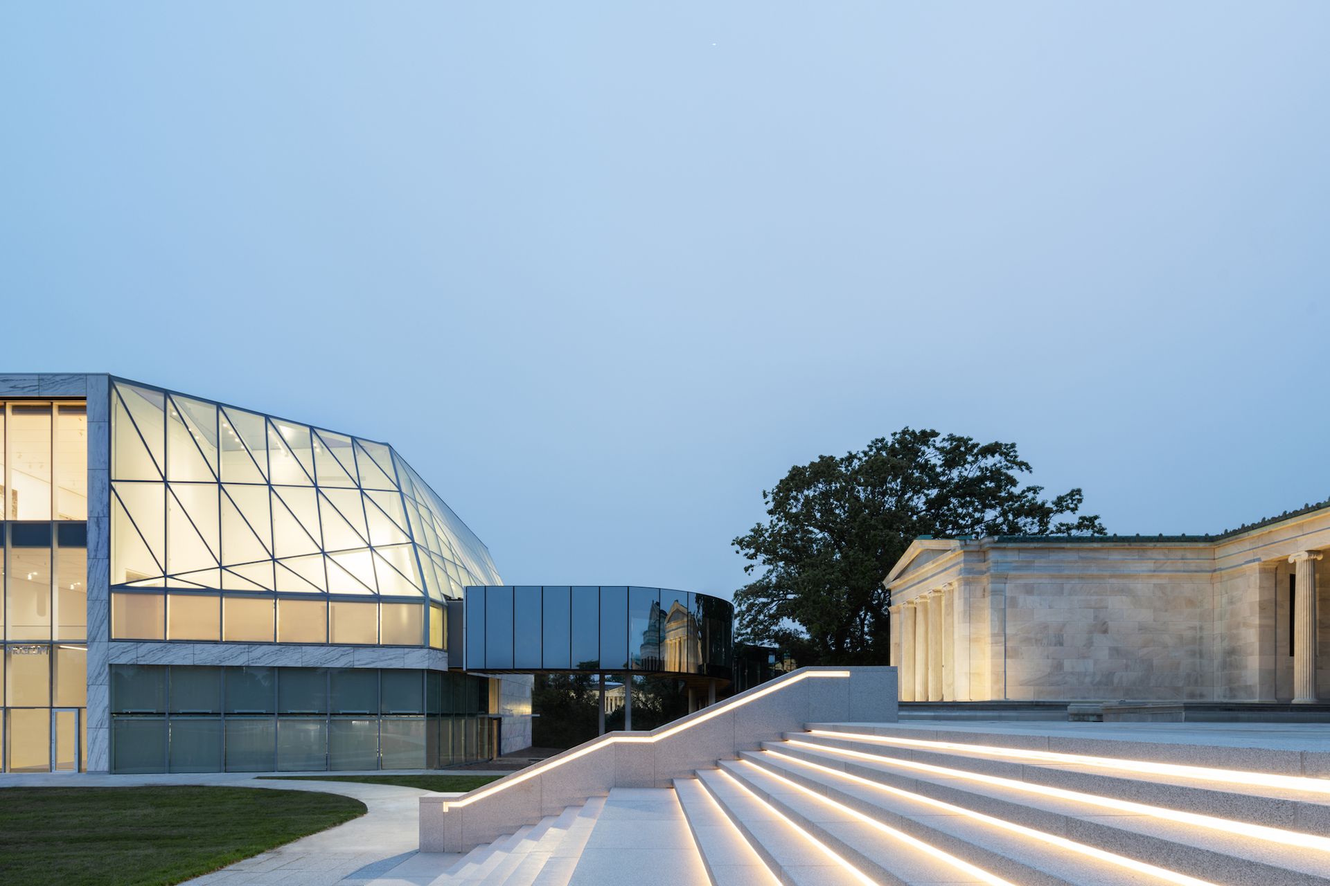
Left to right, the Buffalo AKG Art Museum’s Gundlach Building, the Albright Bridge, and the Wilmers Building Marco Cappelletti
In the adjacent Wilmers Building, the architectural interventions are more subtle but no less significant. Most immediately apparent is the restoration of the exterior staircase leading to the west facade of the building, which had been demolished decades ago to make way for surface parking for cars. This has been moved underground, restoring the museum’s original approach, with its wide lawn and grand staircase. Inside, the cracked marble floors have been replaced with red oak and, above, the entire roof of the building has been replaced. “This project had a component of adaptive reuse, restoration, a new building and landscaping,” says Shigematsu. “It’s a dream job.”
But the most striking feature of the oldest building on campus is the showcase for the museum’s curators of their permanent collection. Chief Curator Cathleen Chaffee and Senior Collection Curator Holly E. Hughes – who was previously alternate between presentations of the collection and temporary exhibitions due to the lack of space in the gallery – came out the greatest canons, from stellar works by Louise Nevelson, Willem de Kooning, Helen Frankenthaler, Mark Rothko, Joan Mitchell and Jackson Pollock, to textbook pieces by Pablo Picasso, Paul Gauguin, Henri Matisse and Frida Kahlo, as well as surprising examples by Elaine de Kooning, Richard Diebenkorn, Jacob Lawrence and Claes Oldenburg.
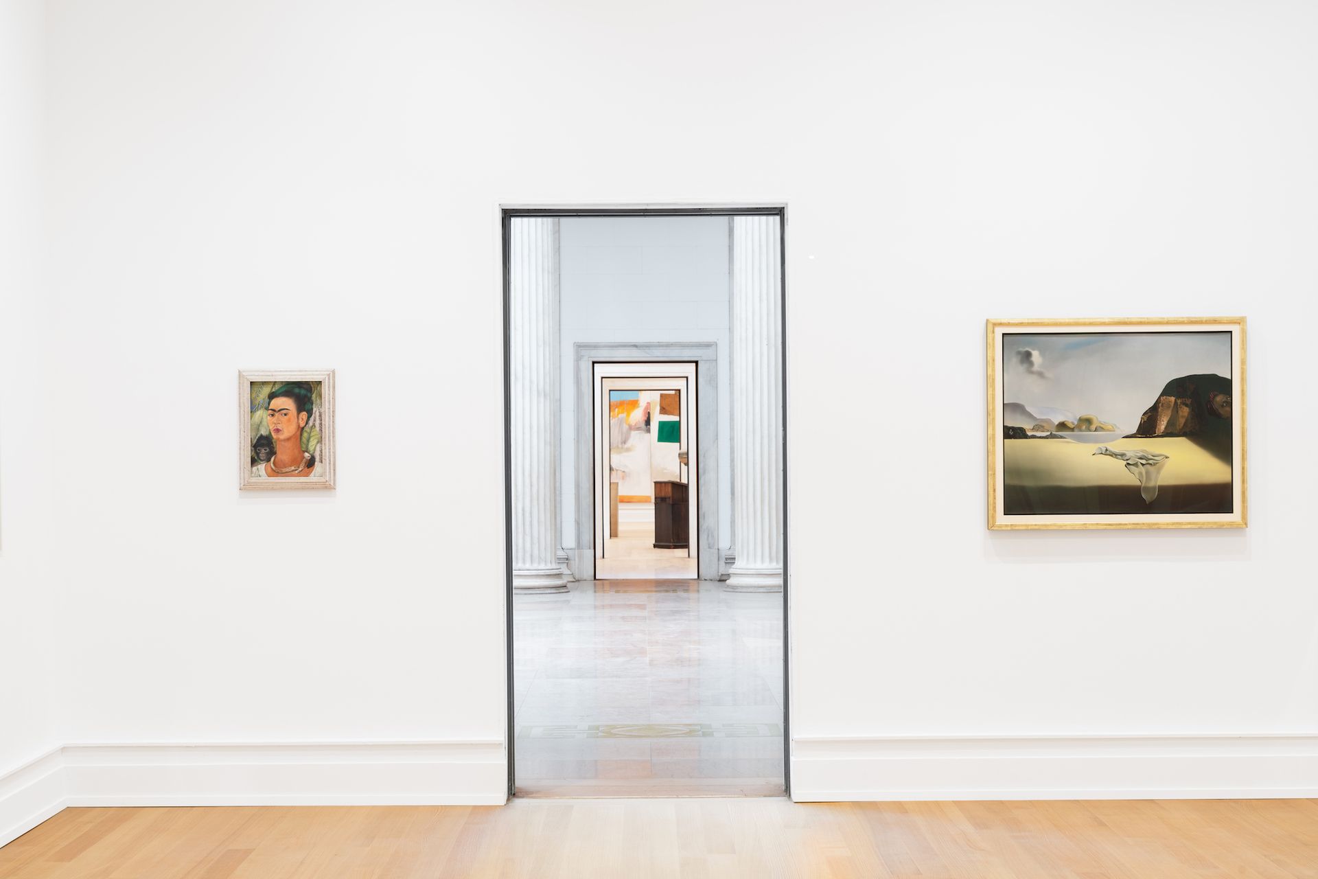
View of a gallery in the Wilmers Building of the Buffalo AKG Art Museum with, from left to right: Frida Kahlo, Self-Portrait with Monkey (1938); Robert Rauschenberg, ace (1962); Edouard Kienholz, The Minister (1961); and Salvador Dalí, The transparent simulacrum of the feigned image (1938) Marco Cappelletti
As museum director Janne Sirén points out, many of the jewels in the collection were acquired the same year they were made or shortly thereafter. “We have been a contemporary art institution since our inception,” he says.
The examples of this commitment to the contemporary through the museum’s transformed campus, the final elements of which are due for completion at the end of August, are too numerous to mention. They include a exposure (until October 30) revisiting his groundbreaking 1910 photographic exhibition (the first in an American museum), the restoration of Leo Villareal’s first installation Luminous matrix (2005) on the facade of the Knox Building, a commission by Swedish artist Miriam Bäckström created for the staircase leading to the new underground car park using virtual reality and 3D mapping technologies, and installation artist Lap-See Lam’s first solo exhibition in a North American museum, which inaugurates the new theatrical space of the Gundlach Building (until January 1, 2024).
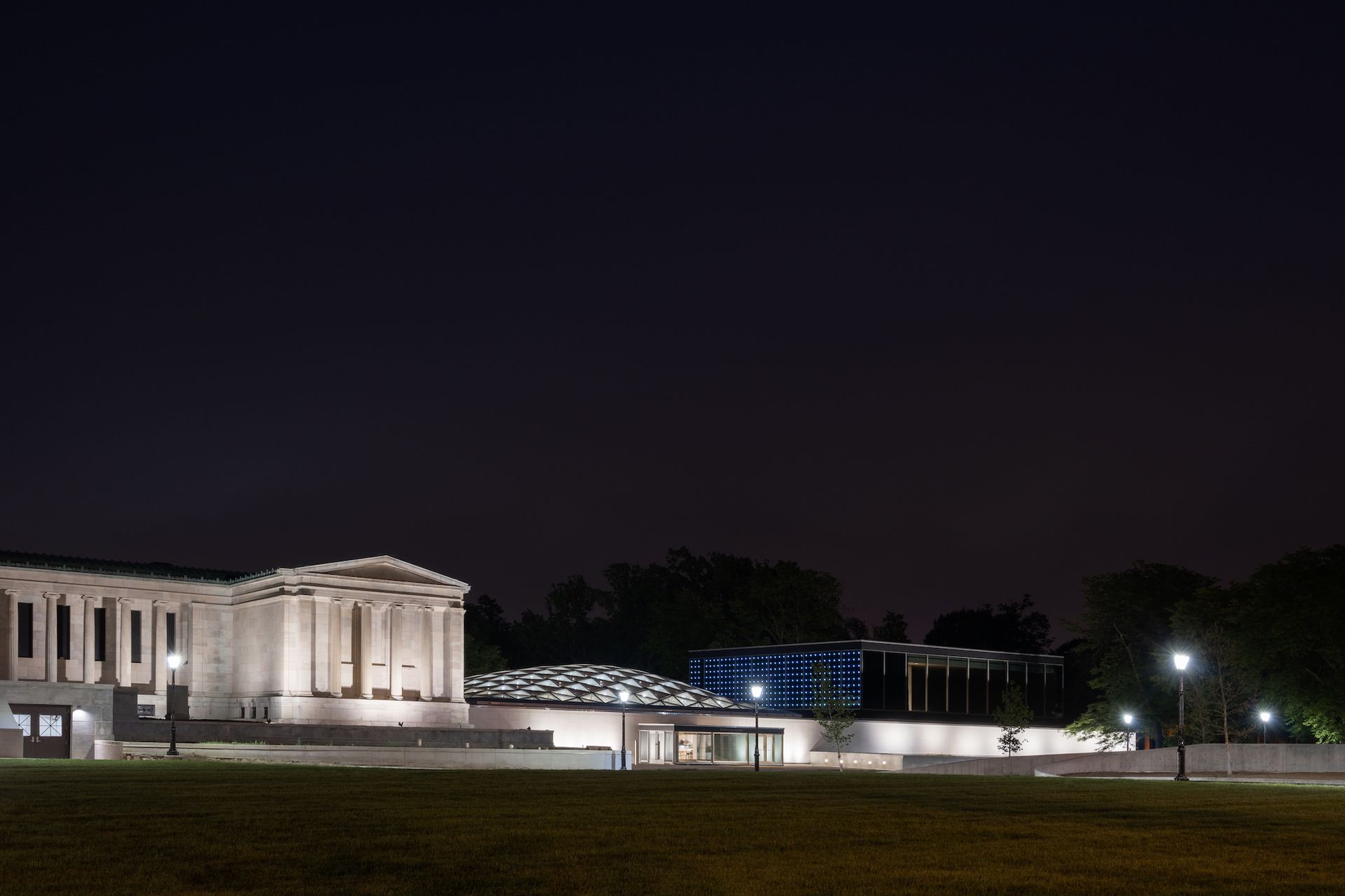
From left to right, Robert and Elisabeth from the Buffalo AKG Art Museum
Wilmers Building, the Seymour H. Knox Building with common sky (2022) by Olafur Eliasson and Sebastian Behmann of Studio Other Spaces and Knox Building Auditorium with Luminous matrix (2005) by Leo Villarreal Marco Cappelletti
Throughout, amid changing art movements and building styles – from post-impressionist to digital art, from neoclassical to postmodern architecture – the new Buffalo AKG Art Museum remains, once again, a remarkably cohesive place. The architecture avoids spectacular and excessive gestures, retaining a human scale and a tone that favors modern and contemporary art.
“Radical accessibility, openness and transparency create more aura in our time than creating something that is deliberately inaccessible,” says Shigematsu. “Being iconic means not creating an iconic architecture, but an iconic place.”
