

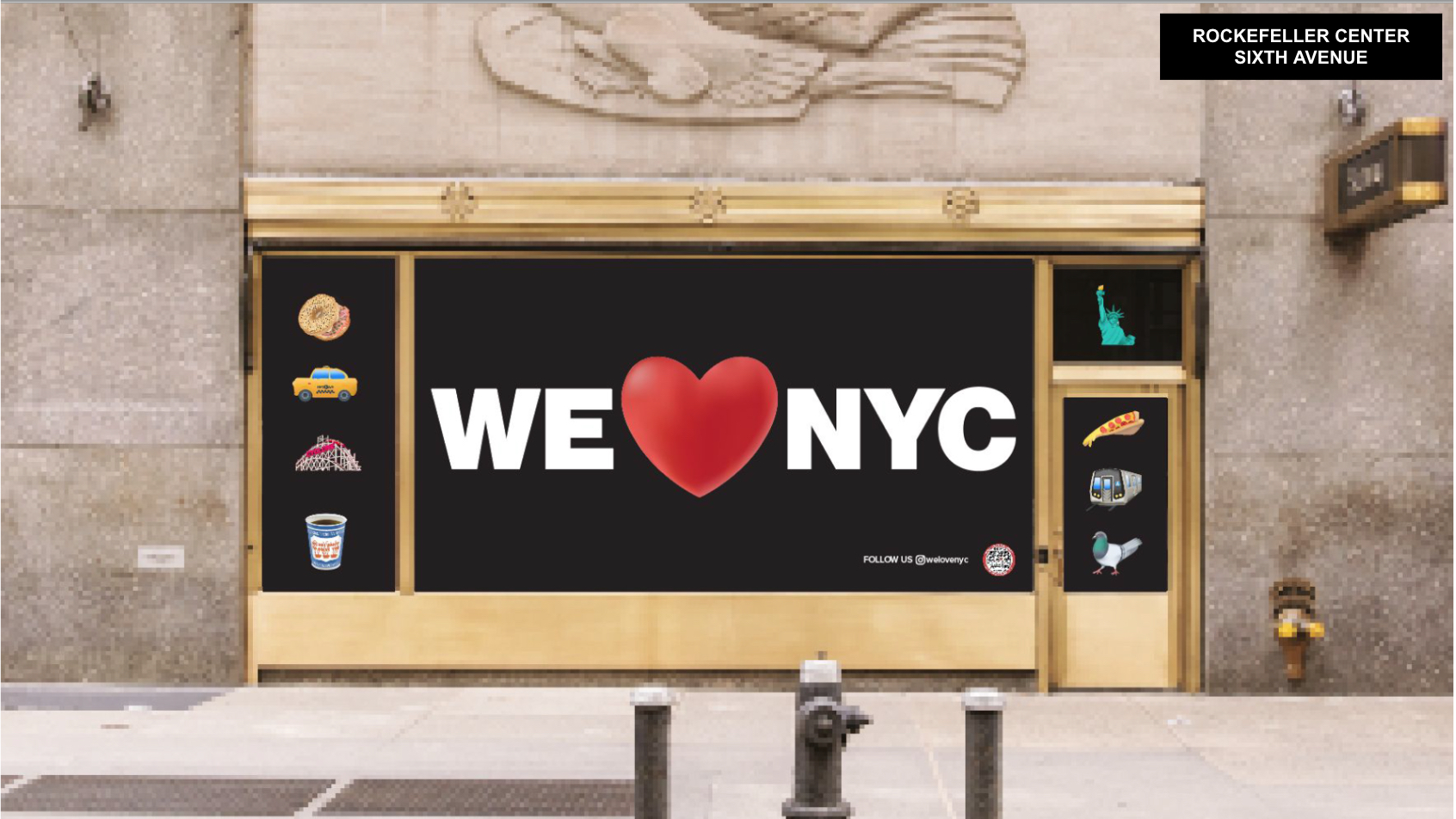
“If it ain’t broke, don’t fix it,” said no one in the cohort of New York State and City decision-makers who launched the new “We ❤️ NYC” design on Monday, March 20. Partnership for the New York City Foundation, a non-profit made up of business and organizational leaders, unveiled the logo as part of the campaign to inspire civic engagement and volunteerism in the five boroughs. Organizers succeeded in uniting New Yorkers, inspiring agreement across the boroughs that the new design is horrible.
“New York City benefits from the greatest concentration of diverse talent in the world,” Partnership for New York City Co-Chair and Pfizer CEO Albert Bourla said in a statement. “This campaign aims to channel the energy and resources of millions of New Yorkers into projects that reaffirm that we are the safest, cleanest and most vibrant city in the world.”

The brand’s branding updates the iconic “I ❤️ NY” Milton Glaser design created between 1975 and 1976. For many New Yorkers, the economic difficulties experienced at the start of the COVID-19 pandemic, particularly in the months when NYC was still the virus epicenterbrought back memories of the financial crisis of the 1970s. William S. Doyle, then New York State Assistant Commissioner of Commerce, had commissioned Glaser’s logo for a tourism and branding campaign launched in 1977 to encourage New Yorkers as a city almost went bankrupt in 1975. Similarly, the “We ❤️ NYC” campaign hopes to inspire a “post-pandemic resurgence of the city and its neighborhoods” through different initiatives and partnerships with various NYC departments such as parks, sanitation and small business services.
Marketing manager Maryam Banikarim and others leading the campaign sought permission from the New York State Department of Economic Development (Empire State Development) – which controls the original “I ❤️ NY” and “We ❤️ NYC” – for the revamp. They decided to replace the “I” with a “we” and focus the campaign exclusively on NYC. banikarim said Hyperallergic that the updated logo is meant to live alongside the iconic original and speak specifically to the city.
“It’s a time for We, not I,” she said. Advertising agency Founders suggested converting the flattened heart into an emoji to reflect a modern era, and designer Graham Clifford pulled the new lettering from the typography used by the Metropolitan Transportation Authority for signage of the Metro.
Reactions on Twitter range from shock and confusion to anger. Many wonder why the state would allow the design change when the original works just fine. Dewey Saunders, visual artist based in Los Angeles replied that the logo was “literally the worst design I’ve ever seen”, while another Twitter user said the design had “zero loot”. Political journalist Grace Segers noted that “We ❤️ NYC” could have been created with Microsoft Paint. Some have expressed concerns about the readability of the new square format design, pointing out that viewers might interpret the text as “We NYC ❤️”.
However, writer and journalist David Colon recalled Twitter users that nothing is more beautiful than New Yorkers uniting against bad art or graphic design. Colon wrote, “It’s the first day of spring, and everyone in New York is gathering to throw trash at the WE NYC HEART logo like it’s the Green Goblin.”